I’m super happy to start this post with the final version of this blog’s logo! And it’s something to celebrate.
If you are new to this blog, you need to know that this is, indeed, a big deal because I’ve been working on this for a couple of weeks. I actually went from being “just ok” with the design to overly excited. Why? Well, I personally think that it’s just such a cute logo:
Also, we’ve come a long way!
There is a detailed post on how I created my first draft using Adobe Illustrator, which basically started out like this:
…Later turning into this:
The value of feedback
After receiving feedback both from my teacher and classmates, I was able to recognize some problems with the design; details here and there that I could not have identified without another pair of eyes pointing them out. Lucky for me, I had more than one pair of eyes helping me.
Among the things my classmates and professor pointed out were:
- The unequal alignment of the bars of the bridge. This came as a shock to me hehe. I aligned the bars at some point, but when finishing the first draft, I forgot to check. When reviewing the drawing, I realized that the bars were all different lengths and that they were not equally distributed within the space.
- A classmate wisely pointed out that most representations of the Golden Gate Bridge usually included two bars, not three. Three bars reminded him of the less famous Bay Bridge, which connects Oakland to San Francisco. While I love the Bay Bridge, it is definitely not the icon of the city I wanted to include in my logo.
- The odd shadow on the dog’s tongue. Here I have to be honest when I uploaded my draft I completely missed the weird shadows that distorted the doggie’s tongue. Was it drool? Was it fluff? Hahaha, nope. Actually, it was a rookie mistake.
- The background color was very bright but did not complement the dog.
- The cursive font that would probably be hard to read if scaled down.
- The flat design was too flat: no gradients, no shadows. This clearly became more clear when I played around with scaling the logo.
Redesign the redesign
While the final logo looks somewhat similar to the draft, I started the design again from scratch, except for the dog. The first thing I did was draw a new bridge, making it bright red this time. I was very careful to align and distribute all the bars, and in order to achieve symmetry, I relied a lot on using rulers and guides as well as copying and reflecting the bars. I found it easier to center the bridge to the circle by grouping the bars and aligning them to the background.
With the bridge in place, I decided to add some dimension to the bridge. This was very simple! I added a gradient to the vertical bars of the bridge, making the colors red and cream. I arranged the gradient in several ways and ended up making it linear. ( I think it kind of looks a little like Karl the Fog 😉 )
So far, so good. I also fixed the odd shapes on the dog’s tongue. I used the pen tool and adjusted the shape so as to leave a subtle shadow around the tongue, one that definitely did not make people think of drool.
The final adjustments were simple, but essential. I modified the text and went to a basic, easy to read font. This allowed me to apply an effect to the text without any issues. I re-arranged the text to the upper part of the logo to achieve balance. The last step was to add some shadows to the different components of the logo, so they can stand out.
I adjusted the drop shadow effect to each of the elements to get the look I wanted. I saved how the logo looked without the two final adjustments:
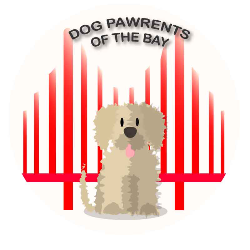
I think that moving the text and addking shadows really made a difference!
And, voilá! A logo was born!
Wags and kisses,
Mocha’s mom.
