I will start by saying, I am not an artistic person. I had never even explored the tools CC could offer, so it was good to gain some knowledge of these programs.
The new logo
Illustrator, we meet again
I went back to the software I struggled with the most: Illustrator.
I found it both difficult AND manageable.
I was not 100% satisfied with my original logo submission.
As a marketing and communications professional, knowing the tools to design a logo, even if it’s for a pitch, is a valuable skill.
For a long time, I’ve worked in brand building and one of its basics is having a good LOGO. I decided to treat the blog as a brand that needed a strong logo.
What changed?
Old
New
The first change I made was re-centering and aligning everything. After so many iterations, the different elements of the logo were not aligned.
Additionally, I changed the background color. First, I wanted a color that could make the logo stand out, make the letters easy to read AND that would go better with the minimalist color scheme of the blog.
I changed the color of the text and made it easier to read. I also added a reflection to make it stand out. I achieved this by copying the text, creating an outline, using transform>reflect, and applying a linear gradient. The gradient fades from white to black with a 0% opacity, so it looks like it’s fading against the background.
Lastly, I added some depth to the bridge and puppy by creating a small blend path for both shapes.
I decided to make those changes in order to create a more appealing logo, that feels younger and more millennial. My target audience are mostly millennials, the group who has the most “dog parents”.
This week marks the end of the final unit for my Professional Multimedia Content Creation class, COM 561. It also marks the 7th week of shelter in place in the Bay Area and California. While some of our friends in the Midwest are starting to get haircuts and grooming appointments for the dogs, we are still…here. More grateful than ever that we have a dog to help us pass the time.
For that reason, the past two weeks were pretty much a blur. I stayed home, worked on my Adobe Premiere project, and watched my classmates’ videos. Apart from that, there’s really nothing to report. The good thing is that working on my video kept me busy and while I was unable to get new material (thanks Covid-19 🙄), the topic I chose makes me happy.
This week was more about fine-tuning details here and there, and improving the video story draft I submitted a couple of weeks ago. Honestly, I also took a couple of days off from this video. By watching it SO many times, I began to ignore the things that needed to be improved, most of which were very accurately pointed out by my classmates.
The final video story
First, you should know that there were no major changes because as I mentioned, I could not get new footage. The storyboard remained the same and my actors (hehehe 😉) are still Mocha and his dad. Here’s what did change:
Transitions. The lack of variety in my transitions was, overwhelmingly, the most criticized (constructively) aspect of my video story. In my original post, I commented that I had purposely used the same type of transitions to avoid making them a distraction. Turns out, I overdid it. I was SO consistent with the transitions, that they became a distraction because of how repetitive they were. I added different transitions, trying to be consistent with the scenes.
L-Cuts and J-Cuts. One of my classmates pointed out that many of the transitions in Adobe Premiere were cheesy, but that L-Cuts and J-Cuts could help. I was watching videos to better give me an idea of how to best incorporate these in my video story and I came across this phrase: “The best L-Cuts and J-Cuts are those that go unnoticed.” Initially, I had included more than the 2 L-Cuts and 1 J-Cut you can see in my video story. I ended up reducing them because most of my audio was a voiceover narration. I used them to break up what felt to me like very long scenes. For example, the scene where I am in my living room and Mocha is doing what he does best: nap.
Sound. I played around with sound effects on Premiere. Since I don’t have a separate mic, I had scenes with very loud background noises. Particularly the scene where I am in the living room, you could hear a very loud humming noise. For my draft, I increased the dB of the audio, but that didn’t work very well because it increased the volume of everything. For my final video story, I used the “Dehummer” and it worked like a charm!
Music. Originally, I had only used a sad song for my introduction, called “Sad Song”. This song along the typewriter effect are both free to use under CC license 0 and can be downloaded from https://freesound.org/. For this video story, when the scenes go from black & white to color, the background music goes from sad to happy. I added a song called Happy and Joyful Children which I downloaded from SoundCloud and is free to use. If you are working on a video that needs a catchy, happy tune, this might be ideal for you! I added the link to the song at the end of my post.
Text. The animated text is one of my favorite features of the video. I animated the text with keyframes and used the sound effect on the background. I made the fonts larger and added a couple of seconds to everything so it’s easy to read.
With that, I hope you enjoy the video and remain safe and healthy.
To see the video directly on Youtube please click here or scroll down for the embedded video.
What is a blog dedicated to places to go and things to do supposed to talk about during a time when there are NO places to go or things to do?
In my mind, this is the perfect newspaper haha.
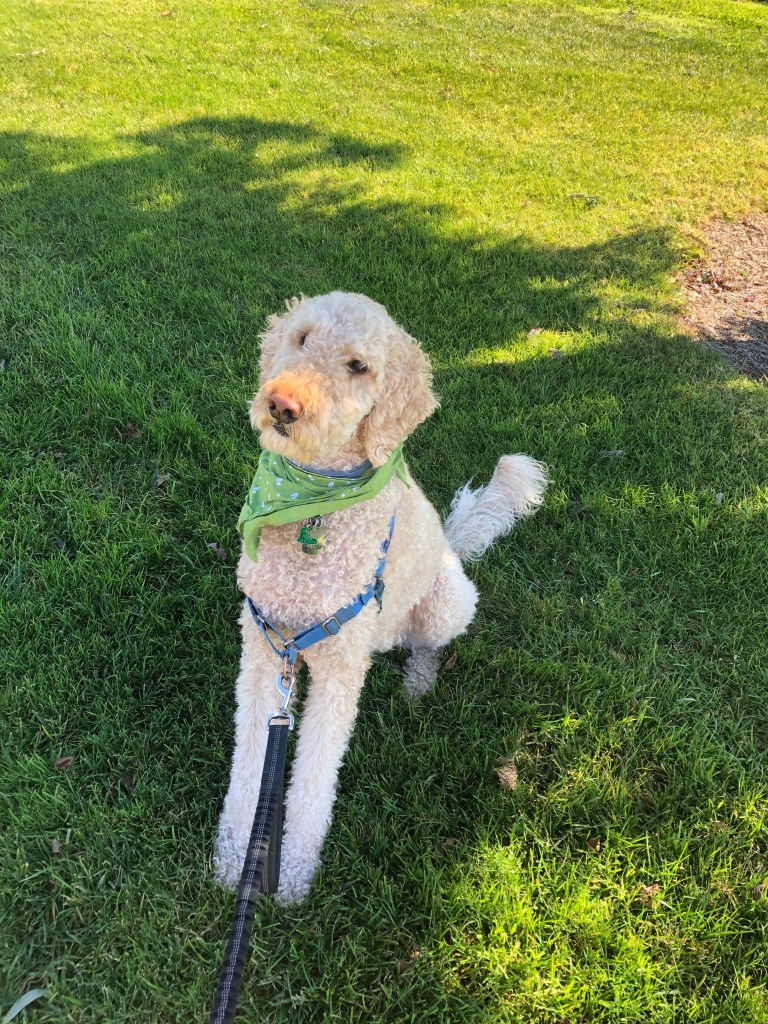
The shelter in place order that’s been in effect in the Bay Area for a month now seriously changed the original plan I had for this video. I was originally planning to interview at least 3 people and talk about our favorite dog-friendly hiking trails that are shaded (given that summer is coming). Unfortunately, we are confined to our small condo and the open spaced we can walk/bike to. On the bright side, our quarantine experience hasn’t been terrible and one thing I’m sure has influenced this is the existence of Mocha. Dogs can be such a great company and this inspired me to do a micro-documentary on our experience.
The other thing that inspired me to do this story is the fact that I know how therapeutic and calming dogs can be. A pandemic is a stressful time, so we’re lucky to have a dog that can take our mind off of being “stuck” at home and not knowing when we’ll be able to travel internationally and see our family in Mexico.
If you didn’t know, Mocha is a “professional” therapy dog (yes, that’s a thing). Last year, he passed some tests and became an official member of Furry Friends, a wonderful organization that visits nursing homes, hospitals, retirement communities, libraries, schools, and other locations. Therapy dogs are believed to bring peace and good vibes to people going through tough times. Although we haven’t been able to do any visits because of COVID-19, we have experienced first-hand the calming effect a dog can have when feeling stressed or overwhelmed.
Bringing the story to life
Given the circumstances, I was limited with my locations but had fun experimenting with different angles and shots. Since I did some recording outdoors and my only filming equipment is my smartphone, I used the credit card trick to get good audio. Once I was editing on Adobe Premiere, I found that I had to make minor adjustments to the audio from the footage filmed outside thanks to this.
My storyboard, which you can view here, turned out a bit different from my original plan but having a script helped me structure everything. I worked on 3 different scripts, timed them and followed the one I liked best.
As we learned in class, I shot (a lot) more footage than I thought I needed. I have at least 1 hour of video that I used to create this 2:30 mins video story. When filming I stuck to the basics learned in the first week: the 10-second rule and the 3×3 method. Sometimes, getting close-up shots was hard because while Mocha is a professional therapy dog (ha!), he’s not a dog actor hehe, so he moved a lot. The shots I got in open spaces, mostly in our local parks, were slightly rushed at times, considering I had to move if another person was walking by.
Setting scenes, sound effects and video transitions
I decided to use music for the introductory part of the video and not use any more music after that because I worried about making it feel stuffed. The song I used is literally called “sad song” and is free to use under Creative Commons License 0. I downloaded it from http://soundcloud.com/. The other effect I used was a typewriter sound I downloaded from http://freesound.org/. This sound was also free to use under CC License 0.
To animate the text I used keyframes, adding the letters one by one. This was super simple and I think effective at grabbing the viewer’s attention vs. displaying static text.
As far as video transitions, I used 3:
Cross dissolve for most of them.
Dip to black when the scene began or ended with black video.
Dip to white for the interviews
If anything, this is a video on a positive thing that has happened as a consequence of sheltering in place due to COVID-19. As a family with a dog, we are so grateful to have him in our lives at this time.
We hope you enjoy, or at least laugh at how dog-obsessed we are.
This week I worked on an audio story about…dogs! (Surprise surprise ha!) As a dog-obsessed human, I find it both comforting and interesting how others relate to their pets. I don’t feel crazy! With so many of our friends and relatives having dogs instead of children, businesses catering to dogs and friendships formed through doggie play-dates; my curiosity got the best of me. Why are some of us so obsessed with our dogs?
A couple of weeks ago, I made a draft of this audio story and met some nice people who didn’t look at me funny after asking them about dogs. Let me tell you, a lot has changed since then!
We’ve been “sheltering in place” because of COVID-19, so, whenever we’re outside walking Mocha, we actively avoid people. Mocha has been living his best life though, getting to spend all day with his humans. The humans on the other hand, are trying to find toilet paper. (Sad but true)
Three weeks ago, I talked to people who were out and about walking their dogs and got about 25 minutes of raw material, which I then edited and trimmed into a 3 minutes audio story. Unfortunately, re-doing interviews or finding new people to interview was not possible due to the COVID-19 situation :(. Hence, I mainly changed the following:
My narration. One of my classmates made me re-think the way I structured my story, so I changed the information to make the story more entertaining and relatable. I decided to keep the story very similar because I honestly really liked it. It felt like a happy-feel capsule.
Fixed the volume and echo of my interviewees. Through youtube tutorials and google searches (#theinternetisawesome), I learned some tips and tricks on how to improve the echo and volume of the clips. The difference is subtle, but I think it improves the overall quality of the audio. As always, I wish I had more time to play around with Audition and try different effects.
Adjusted the volume of the music bed and ambient sounds. A comment I received from several people was how loud the background was, which was distracting and made certain parts of the story difficult to understand. Since the song I used for my background had a lot of variations in the track itself, I selected a portion and looped the song. The sound was steadier that way and I don’t think you can tell the difference.
Fine-tuning sighs and coughs. I also edited out some of my interviewees’ sighs and coughs in order to achieve a cleaner clip.
I’d love to create more audio stories on the greatest love story ever: humans and their dogs! In the future, I’d love to have some equipment other than my cell phone to get better sound quality. So far, I’ve been using an iPhone 8 and Bose headphones, which do a good job but after listening to some of my classmates’ work, recorded with more advanced equipment, you can definitely tell the difference!
That’s it for us! How have you been doing during this tough time? Mocha and I will continue to take lonely walks and enjoy our comfy couch.
Unfortunately, Mocha is the quietest dog ever! Luckily, I was able to interview some humans.
This week, I’ve been working on my audio story and learning to use Adobe Audition. Audition has proved to be easier to manage than Photoshop and Illustrator, however…
Interviewing people is NOT easy D:
I started this audio story pretty confident because as I said, Audition is simpler to use. That was my first mistake! I did not anticipate how hard it is to get people to talk to you, remind them to speak freely and use their normal voices. Some of the people I interviewed felt so self-conscious by the sight of my cell phone recording that they could not relax and talk to me naturally about dogs.
(Here’s to my newly found respect for Terry Gross and Ira Glass…HOW DO THEY DO IT?)
The process for doing this audio story was like this:
Narration.
I made a rough script of what I was going to say. I tried recording my ideas without a script but I had too many mistakes.
Actualities / Soundbites.
I found people to interview. This took some convincing. I asked them 2 questions:
Tell me about your dog
How do you feel about your dog?
After collecting my raw data, I looked for sounds and music that could work for these audio stories. Here is when I tried to “interview” Mocha or get him to bark… he just starred haha. He rarely barks, so of course, I also had to look for dog barking sounds.
Music and sound effects
I used one song and two different barking sounds, all of which I downloaded from freesound.org, are under Creative Commons License CC0 1.0 “Public Domain Dedication.”
Putting the acts and tracks together
Mixing, trimming, re-mixing, adjusting volume. I did a lot of editing to remove filler words. English is not my (or my interviewees’) first language, so getting rid of filler words was definitely a must.
Creating scenes with audio
Adding the music and sound effects the right way made a huge difference. Once I had the audio story in order, I added different sounds to try and create “scenes” for my interview. I liven in a city that seems to be permanently under construction, so I recorded the interviews inside a bathroom haha (the only quiet spot I could find #cityproblems).
I added a music bed and apart from that, I mixed barks and the sounds of a happy dog (mostly Mocha’s dog tags) to try and create the different scenes.
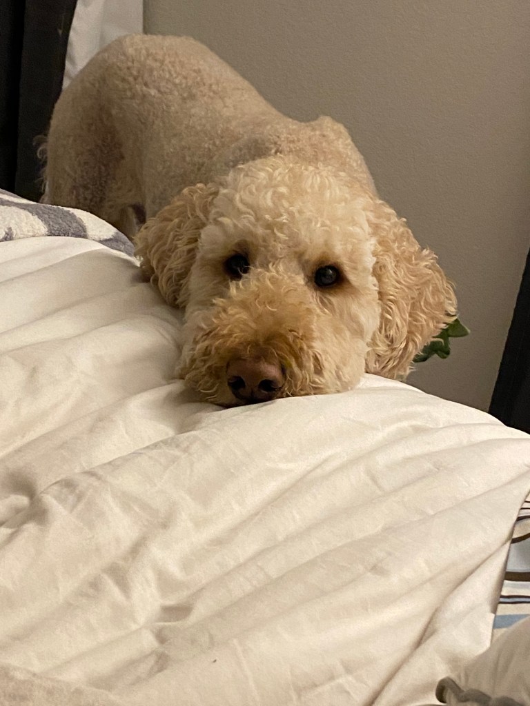
Actual picture of Mocha as I was editing the audio story.
I’m quite curious to see what others think! Communicating through sound is harder than I thought!
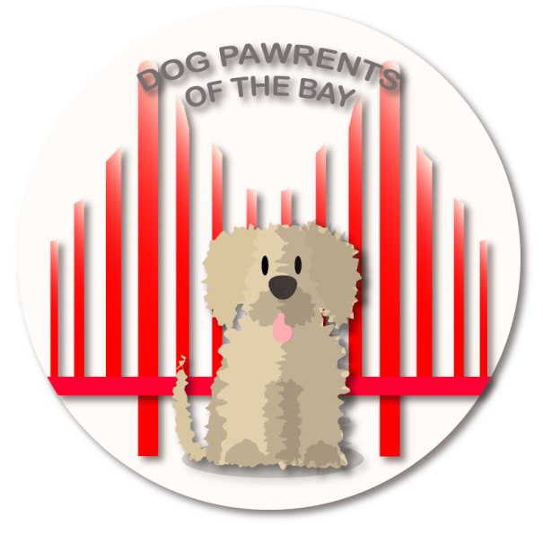
I’m super happy to start this post with the final version of this blog’s logo! And it’s something to celebrate.
If you are new to this blog, you need to know that this is, indeed, a big deal because I’ve been working on this for a couple of weeks. I actually went from being “just ok” with the design to overly excited. Why? Well, I personally think that it’s just such a cute logo:
Also, we’ve come a long way!
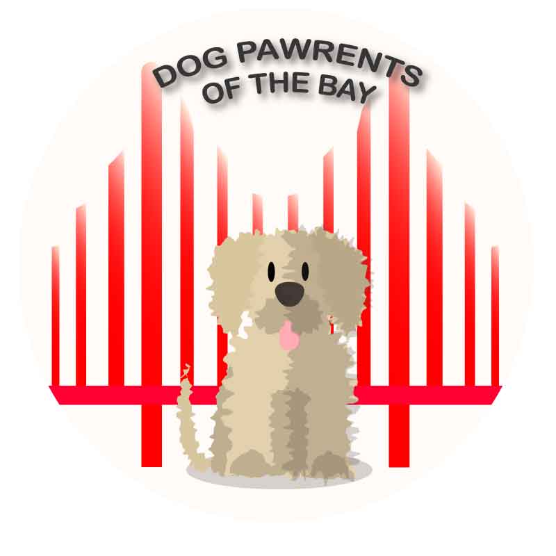
There is a detailed post on how I created my first draft using Adobe Illustrator, which basically started out like this:
…Later turning into this:
The value of feedback
After receiving feedback both from my teacher and classmates, I was able to recognize some problems with the design; details here and there that I could not have identified without another pair of eyes pointing them out. Lucky for me, I had more than one pair of eyes helping me.
Among the things my classmates and professor pointed out were:
The unequal alignment of the bars of the bridge. This came as a shock to me hehe. I aligned the bars at some point, but when finishing the first draft, I forgot to check. When reviewing the drawing, I realized that the bars were all different lengths and that they were not equally distributed within the space.
A classmate wisely pointed out that most representations of the Golden Gate Bridge usually included two bars, not three. Three bars reminded him of the less famous Bay Bridge, which connects Oakland to San Francisco. While I love the Bay Bridge, it is definitely not the icon of the city I wanted to include in my logo.
The odd shadow on the dog’s tongue. Here I have to be honest when I uploaded my draft I completely missed the weird shadows that distorted the doggie’s tongue. Was it drool? Was it fluff? Hahaha, nope. Actually, it was a rookie mistake.
The background color was very bright but did not complement the dog.
The cursive font that would probably be hard to read if scaled down.
The flat design was too flat: no gradients, no shadows. This clearly became more clear when I played around with scaling the logo.
Redesign the redesign
While the final logo looks somewhat similar to the draft, I started the design again from scratch, except for the dog. The first thing I did was draw a new bridge, making it bright red this time. I was very careful to align and distribute all the bars, and in order to achieve symmetry, I relied a lot on using rulers and guides as well as copying and reflecting the bars. I found it easier to center the bridge to the circle by grouping the bars and aligning them to the background.
With the bridge in place, I decided to add some dimension to the bridge. This was very simple! I added a gradient to the vertical bars of the bridge, making the colors red and cream. I arranged the gradient in several ways and ended up making it linear. ( I think it kind of looks a little like Karl the Fog 😉 )
So far, so good. I also fixed the odd shapes on the dog’s tongue. I used the pen tool and adjusted the shape so as to leave a subtle shadow around the tongue, one that definitely did not make people think of drool.
The final adjustments were simple, but essential. I modified the text and went to a basic, easy to read font. This allowed me to apply an effect to the text without any issues. I re-arranged the text to the upper part of the logo to achieve balance. The last step was to add some shadows to the different components of the logo, so they can stand out.
I adjusted the drop shadow effect to each of the elements to get the look I wanted. I saved how the logo looked without the two final adjustments:
I think that moving the text and addking shadows really made a difference!
I created a logo using Adobe Illustrator. If you’re in a hurry, please know that this is the final result:
If you’re going to read the process behind it, welcome! When I started, I wasn’t prepared for my mind to jump from one idea to the next, doodling ideas before deciding on the design I wanted.
As usual, inspiration hit me with crazy ideas, some so elaborated that I knew I could never be able to make them a reality. And, KISS! Simple was the goal! For a moment I had decided against including the bridge, thinking it was too cliched. But as I’ve said before, is there anything more iconic to this city than our beloved GG?
A logo is worth a 1000 words
The readings and videos made one thing very clear: logos are uniquely important. Even the simplest logo is everything when done right. As this FX article mentions, simplicity is always a win-win solution. Which is why, after going through all of these ideas in my head, like these:
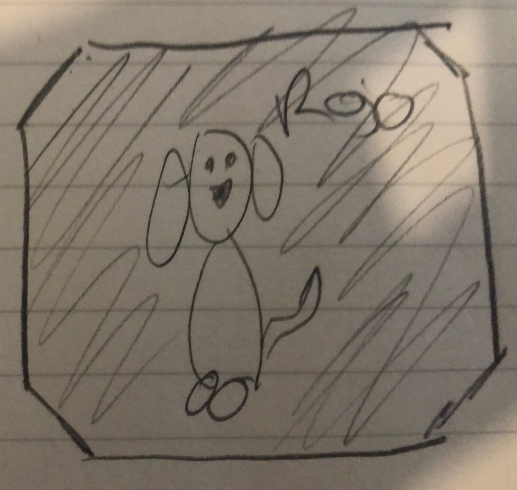
Keep in mind that drawing is not my forte…
I ended up with this hand made draft:
…Clearly haha
The Dog Pawrents of the Bay logo
The logo I finally decided to make has 4 main components: a bold background color, two shapes and text.
The red background: As I type, I am not 100% sold on using such a bold hue of red because I know it can be too much. On the other hand, red gets attention and is directly related to my topic.
The Golden Gate silhouette: I could not not use it. This human loves dogs, puns and clichés, ok?
A fluffy dog: Drawing a “fluffy” flat shape was also fun to play around with Illustrator.
The name of the Blog: Again, not sold. Should it stay or should it go?
Illustrator, we meet again.
The process of this logo was more straightforward than the making of my Photoshop graphic design because I had a clear idea.
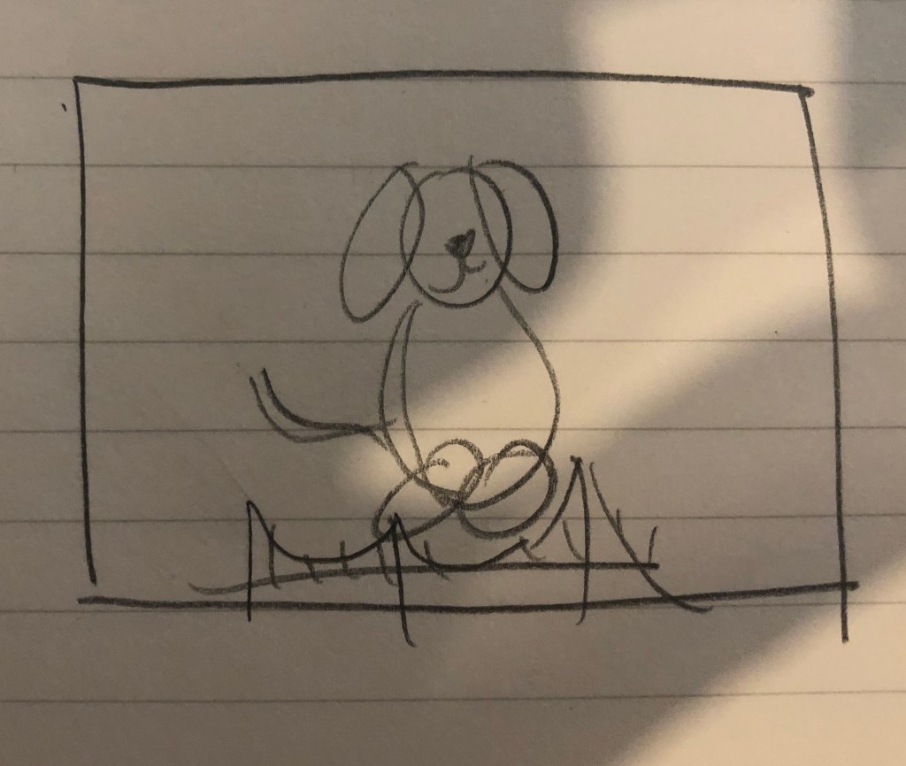
First, the background. As you can see from my hand-drawn doodles, the idea was to use a squared background but while researching logo design, I came across an article that said that circles in logo design projected a positive emotional message. Since this blog is meant to be cheerful, I decided to use a circle to ground my logo.
I made a draft of the draft with Illustrator and this is what I ended up with:
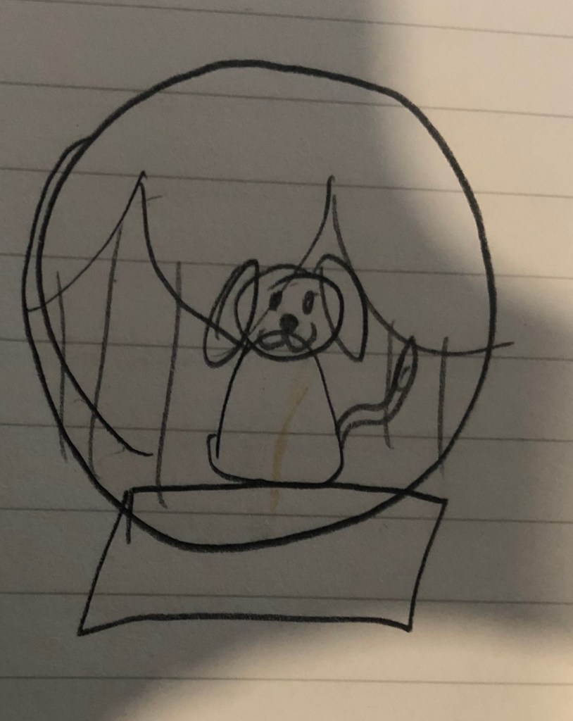
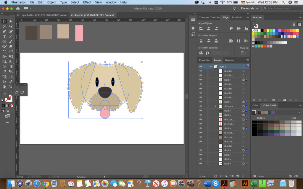
I used the ellipse tool to shape the dog’s body, head and ears. Originally, I started adding anchor points and trying to create the “fluffy dog effect” with the pen tool.
This is what I had before roughening the shapes.
After distorting the drawing, I clicked around and found that the distorting effect “Roughen” achieved the look I wanted. I then used the pen tool to draw the nose and mouth. By creating 4 circles, aligning them and joining them with a rectangle, I created the bone-shaped tag. I used the shape builder to adjust it to my liking. Then, I added the bridge at the bottom of the dog. Originally, I intended to make my logo red and white, remembering the reading on the effective use of Figure and Ground. Hence, I had originally added a small drawing of the bridge at the bottom.
The perfect dog?
After sleeping on it and re-watching the tutorials from last week, I decided I had to:
a) Draw a better dog
b) Balance the bridge and dog
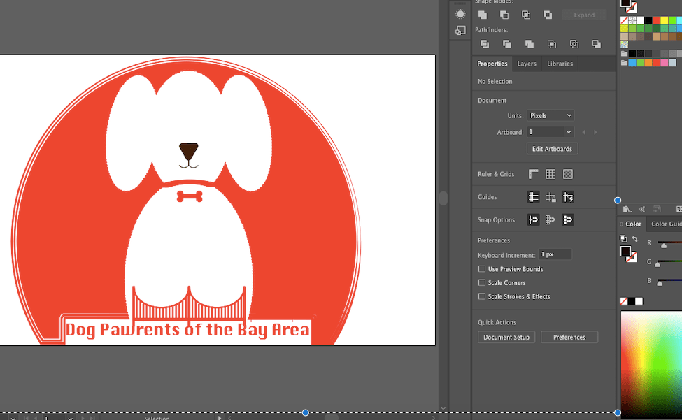
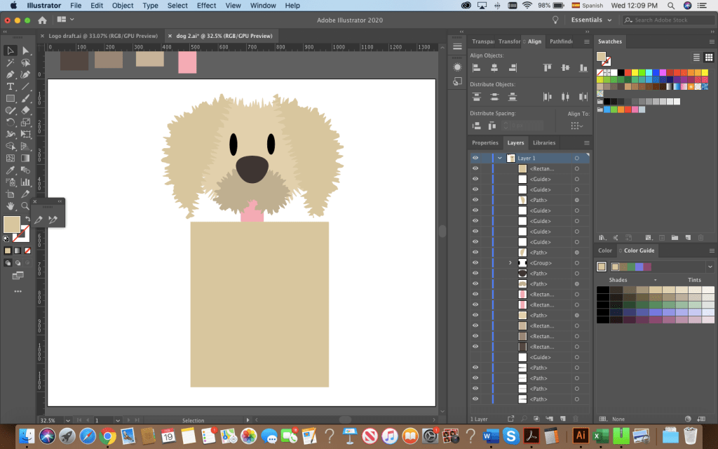
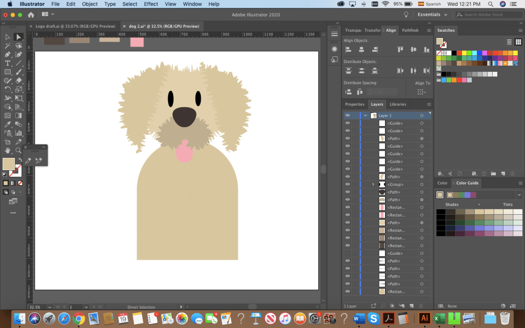
Hours of Illustrator fun resulted in this, the final draft of my logo:
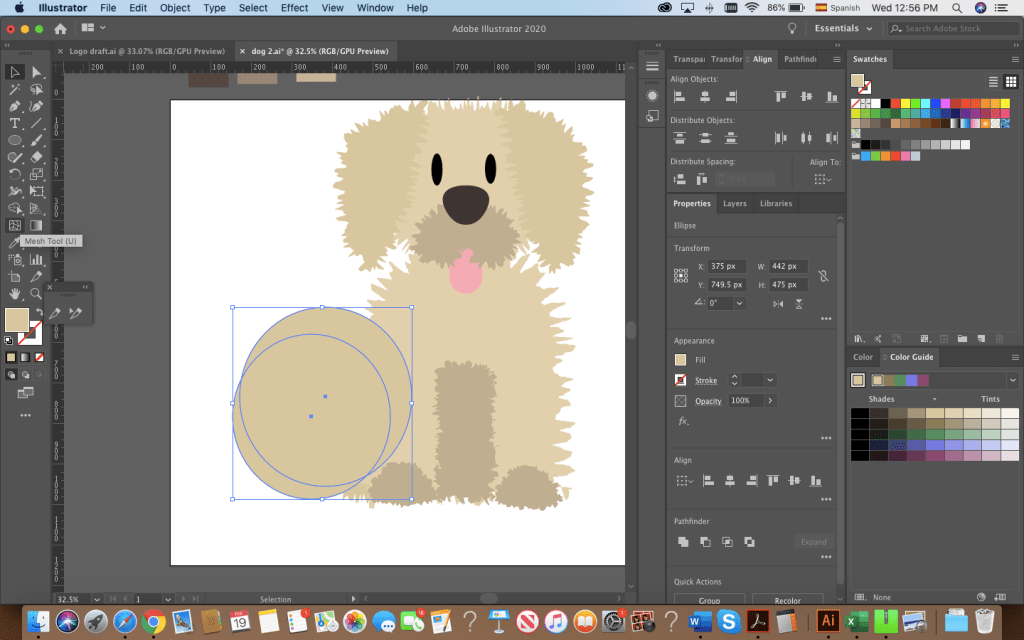
The bridge was simple! I started by making 3 large rectangles, aligning and distributing them. I then created and aligned the smaller poles of the bridge and I drew a circle on top to make the shape of the bridge by using the shape builder tool.
The fluffy dog was easier to draw after having experimented with the shapes, the roughen effect and the pen tool. The most time-consuming part was the head. I started with a circle for the head, ovals for the snout, eyes and tongue. I drew the ears by using the pen tool. Drawing this dog made me appreciate the align and distribute feature for sure! There were some irregularities to my design’s outline, but with the roughen effect and the combination of shapes I was able to get the look I wanted.
The body and paws followed the same process: shapes or drawings made with the pen tool. I used the shape builder to make the tail by overlapping 2 circles.
Originally, I had added the text and left it at that but it felt too flat. I grouped all the shapes that made up my dog, created a copy, drew a rectangle in a greyish tone on top and used the shape builder to create a shaded side of the puppy. I brought the opacity down to 30% to layer the effect and finished with a small gray ellipse at the bottom.
What do you guys think? There are a lot of things I would still like to change but I’m happy to say, I’m satisfied with this draft.