I tried to interview my dog for my draft audio story…

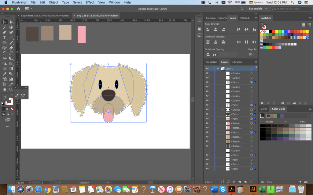
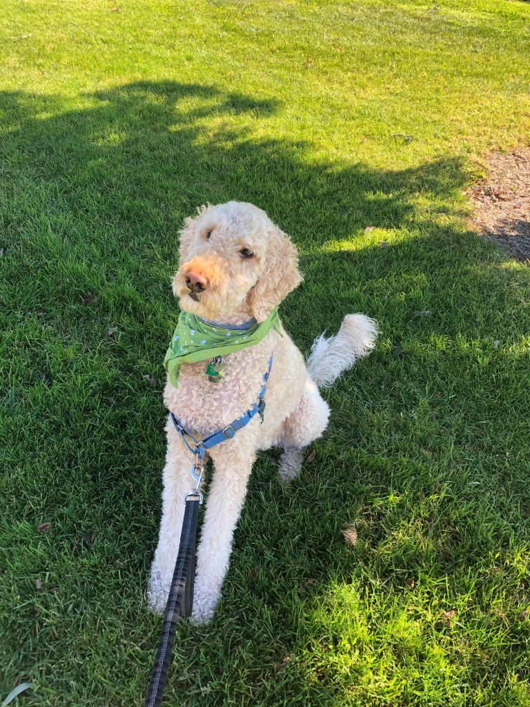
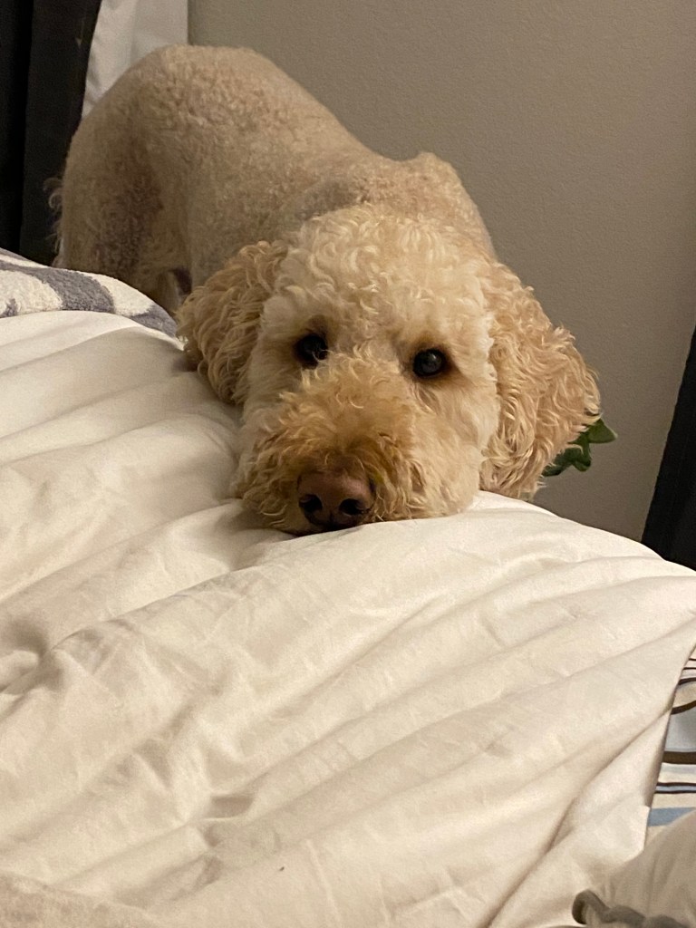
Unfortunately, Mocha is the quietest dog ever! Luckily, I was able to interview some humans.

This week, I’ve been working on my audio story and learning to use Adobe Audition. Audition has proved to be easier to manage than Photoshop and Illustrator, however…

Interviewing people is NOT easy D:

I started this audio story pretty confident because as I said, Audition is simpler to use. That was my first mistake! I did not anticipate how hard it is to get people to talk to you, remind them to speak freely and use their normal voices. Some of the people I interviewed felt so self-conscious by the sight of my cell phone recording that they could not relax and talk to me naturally about dogs.

(Here’s to my newly found respect for Terry Gross and Ira Glass…HOW DO THEY DO IT?)

The process for doing this audio story was like this:

Narration.

  • I made a rough script of what I was going to say. I tried recording my ideas without a script but I had too many mistakes.

Actualities / Soundbites.

  • I found people to interview. This took some convincing. I asked them 2 questions:
    • Tell me about your dog
    • How do you feel about your dog?
  • After collecting my raw data, I looked for sounds and music that could work for these audio stories. Here is when I tried to “interview” Mocha or get him to bark… he just starred haha. He rarely barks, so of course, I also had to look for dog barking sounds.

Music and sound effects

  • I used one song and two different barking sounds, all of which I downloaded from freesound.org, are under Creative Commons License CC0 1.0 “Public Domain Dedication.”

Putting the acts and tracks together

  • Mixing, trimming, re-mixing, adjusting volume. I did a lot of editing to remove filler words. English is not my (or my interviewees’) first language, so getting rid of filler words was definitely a must.

Creating scenes with audio

Adding the music and sound effects the right way made a huge difference. Once I had the audio story in order, I added different sounds to try and create “scenes” for my interview. I liven in a city that seems to be permanently under construction, so I recorded the interviews inside a bathroom haha (the only quiet spot I could find #cityproblems).

I added a music bed and apart from that, I mixed barks and the sounds of a happy dog (mostly Mocha’s dog tags) to try and create the different scenes.

Actual picture of Mocha as I was editing the audio story.

I’m quite curious to see what others think! Communicating through sound is harder than I thought!

Wags and kisses,

Mocha’s mom

The wonders of Illustrator (Logo Design Draft Project)

I created a logo using Adobe Illustrator. If you’re in a hurry, please know that this is the final result:

If you’re going to read the process behind it, welcome! When I started, I wasn’t prepared for my mind to jump from one idea to the next, doodling ideas before deciding on the design I wanted.

As usual, inspiration hit me with crazy ideas, some so elaborated that I knew I could never be able to make them a reality. And, KISS! Simple was the goal! For a moment I had decided against including the bridge, thinking it was too cliched. But as I’ve said before, is there anything more iconic to this city than our beloved GG?

A logo is worth a 1000 words

The readings and videos made one thing very clear: logos are uniquely important. Even the simplest logo is everything when done right. As this FX article mentions, simplicity is always a win-win solution. Which is why, after going through all of these ideas in my head, like these:

I ended up with this hand made draft:

…Clearly haha

The Dog Pawrents of the Bay logo

The logo I finally decided to make has 4 main components: a bold background color, two shapes and text.

  • The red background: As I type, I am not 100% sold on using such a bold hue of red because I know it can be too much. On the other hand, red gets attention and is directly related to my topic.
  • The Golden Gate silhouette: I could not not use it. This human loves dogs, puns and clichés, ok?
  • A fluffy dog: Drawing a “fluffy” flat shape was also fun to play around with Illustrator.
  • The name of the Blog: Again, not sold. Should it stay or should it go?

Illustrator, we meet again.

The process of this logo was more straightforward than the making of my Photoshop graphic design because I had a clear idea.

First, the background. As you can see from my hand-drawn doodles, the idea was to use a squared background but while researching logo design, I came across an article that said that circles in logo design projected a positive emotional message. Since this blog is meant to be cheerful, I decided to use a circle to ground my logo.

I made a draft of the draft with Illustrator and this is what I ended up with:

I used the ellipse tool to shape the dog’s body, head and ears. Originally, I started adding anchor points and trying to create the “fluffy dog effect” with the pen tool.

This is what I had before roughening the shapes.

After distorting the drawing, I clicked around and found that the distorting effect “Roughen” achieved the look I wanted. I then used the pen tool to draw the nose and mouth. By creating 4 circles, aligning them and joining them with a rectangle, I created the bone-shaped tag. I used the shape builder to adjust it to my liking. Then, I added the bridge at the bottom of the dog. Originally, I intended to make my logo red and white, remembering the reading on the effective use of Figure and Ground. Hence, I had originally added a small drawing of the bridge at the bottom.

The perfect dog?

After sleeping on it and re-watching the tutorials from last week, I decided I had to:

a) Draw a better dog

b) Balance the bridge and dog

Hours of Illustrator fun resulted in this, the final draft of my logo:

The bridge was simple! I started by making 3 large rectangles, aligning and distributing them. I then created and aligned the smaller poles of the bridge and I drew a circle on top to make the shape of the bridge by using the shape builder tool.

The fluffy dog was easier to draw after having experimented with the shapes, the roughen effect and the pen tool. The most time-consuming part was the head. I started with a circle for the head, ovals for the snout, eyes and tongue. I drew the ears by using the pen tool. Drawing this dog made me appreciate the align and distribute feature for sure! There were some irregularities to my design’s outline, but with the roughen effect and the combination of shapes I was able to get the look I wanted.

The body and paws followed the same process: shapes or drawings made with the pen tool. I used the shape builder to make the tail by overlapping 2 circles.

Originally, I had added the text and left it at that but it felt too flat. I grouped all the shapes that made up my dog, created a copy, drew a rectangle in a greyish tone on top and used the shape builder to create a shaded side of the puppy. I brought the opacity down to 30% to layer the effect and finished with a small gray ellipse at the bottom.

What do you guys think? There are a lot of things I would still like to change but I’m happy to say, I’m satisfied with this draft.

Wags and kisses,

Karla

P.S. Mocha approves!