Welcome Dog Pawrents of the Bay! This past week has been crazz, Mocha and I haven’t been up to much thanks to those rare days where Bay Area weather is just blah. And I did mean “blah”. It’s not terrible – not too cold, rainy or cloudy, simply grey and chilly.
The good news is that I (Karla) have been Photoshopping, designing a photo for the homepage of this blog. I want this picture to see the first thing people notice when they visit the site. I want to make clear what this blog is about: dogs and the SF Bay Area.
Anyway…In the process of choosing a picture for the homepage of this blog, I had two very different ideas in mind. You can quickly scroll and see that no, I did not photoshop Mocha on the moon (yet). However, if you are interested in learning more about the process I followed, keep on reading!
Photo # 1: The Polaroid
This was the first picture I worked on. My attempt, although I need to work on it more, was to create a picture that looked like a Polaroid. To me, polaroid pictures are a synonym of fun family times because even though I was born in 1990, my dad traveled with a Polaroid camera well into 1998.

This image is composed of these 4 different images. You can see how the pictures looked before photoshop magic.


“Golden Gate Bridge during Blue Hour” by Frank Schulenburg [CC BY-SA (https://creativecommons.org/licenses/by-sa/4.0)%5D
When I designed this polaroid image of a dog-family friendly destination, I knew the Golden Gate Bridge had to be a focal point of the image. It’s very important that I mention that this beautiful photo of our beloved bridge, fog-free, was not taken by my camera. I downloaded the picture, called Golden Gate Bridge during blue hour by Frank Schulenburg from Wikimedia Commons.
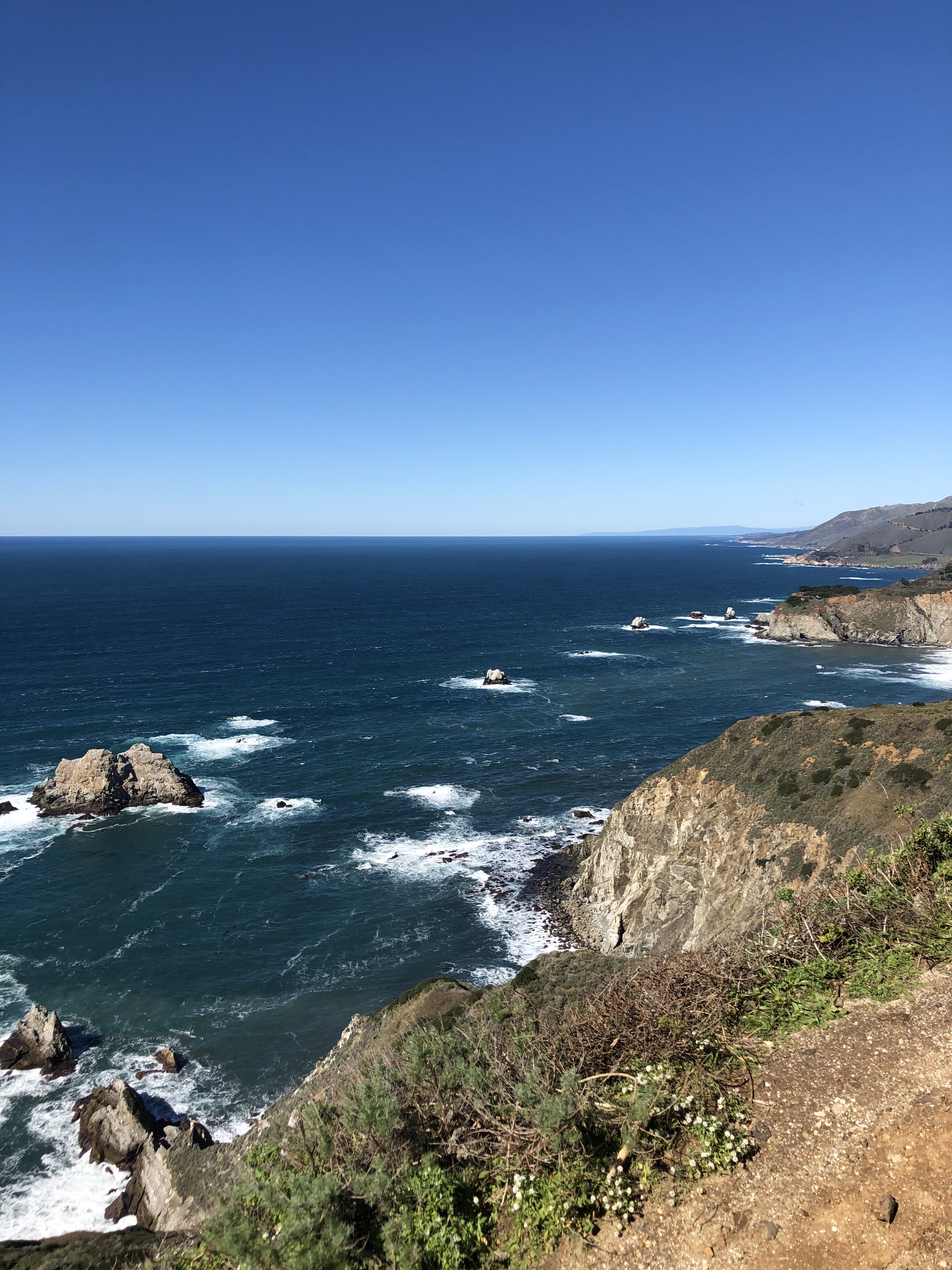
The rest of the images are my own work, featuring Mocha and two of the best dog spots in the area. The locations are stops along the Pacific Coast Highway, all within a 1-hour drive from San Francisco proper.
Working from the bottom, this image consisted of at least 6 layers:
Layer 0 – the bridge. To the image, I applied some layer effects, such as Bevel & Emboss and Drop Shadow.
Layer 1 – Mocha. I created a “layer via copy” by cutting out Mocha from a picture I took in the California Sierra on a snowy day of 2019.
Layer 2- On top of the Golden Gate Bridge and Mocha, I applied a layer mask to add a posterize effect. I kept the distortion of the images to a minimum so it was clearly visible.
Layers 3 and 4 – These were layers via copy from pictures in some of the area’s favorite dog-friendly beaches. Originally, I had posterized the layers too but decided against it to keep some contrast.
Layers 5 and 6 – The final elements of the image are the Paw Print that I used as a frame and the text. I tried to apply the Gestalt Theory by using the paw to combine elements in an interesting yet harmonic way.
Photo # 2: Welcome, or in dog speak: Woofcome!
This image was simply fun to create! I was inspired by those movie posters where the focal point is the protagonist’s face but there are other images inside. It took me hours and at least 4 tutorials to get it done, but I’m quite happy with the result.

The image is actually comprised of 5 different pictures, all of which are my own work except for the picture you can appreciate on the left side, the San Francisco Skyline at night. Here are the originals:


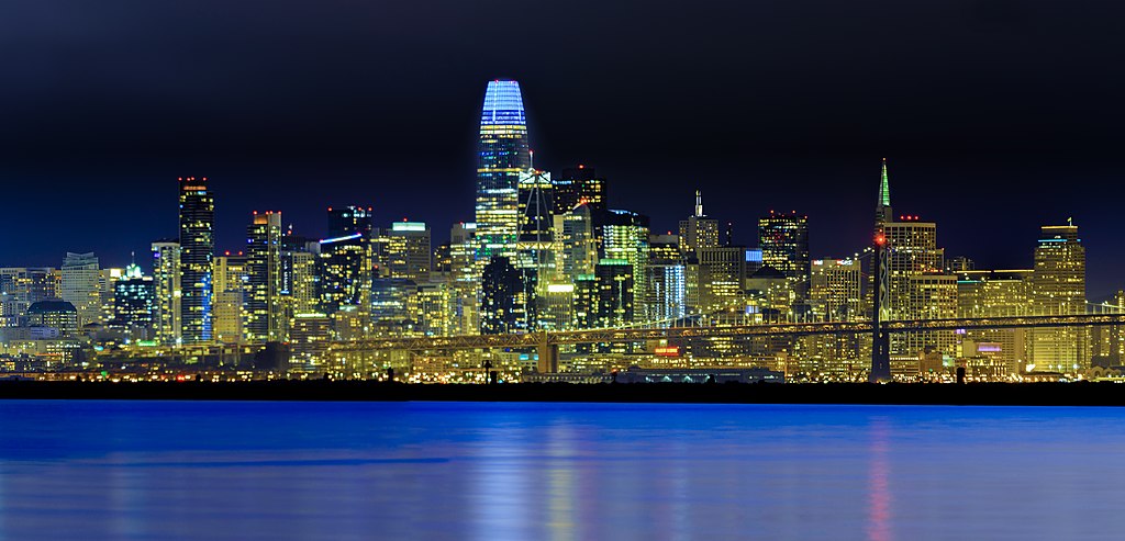
“San Francisco Skyline at night” by Cgbriggs19 [CC BY-SA (https://creativecommons.org/licenses/by-sa/4.0)%5D
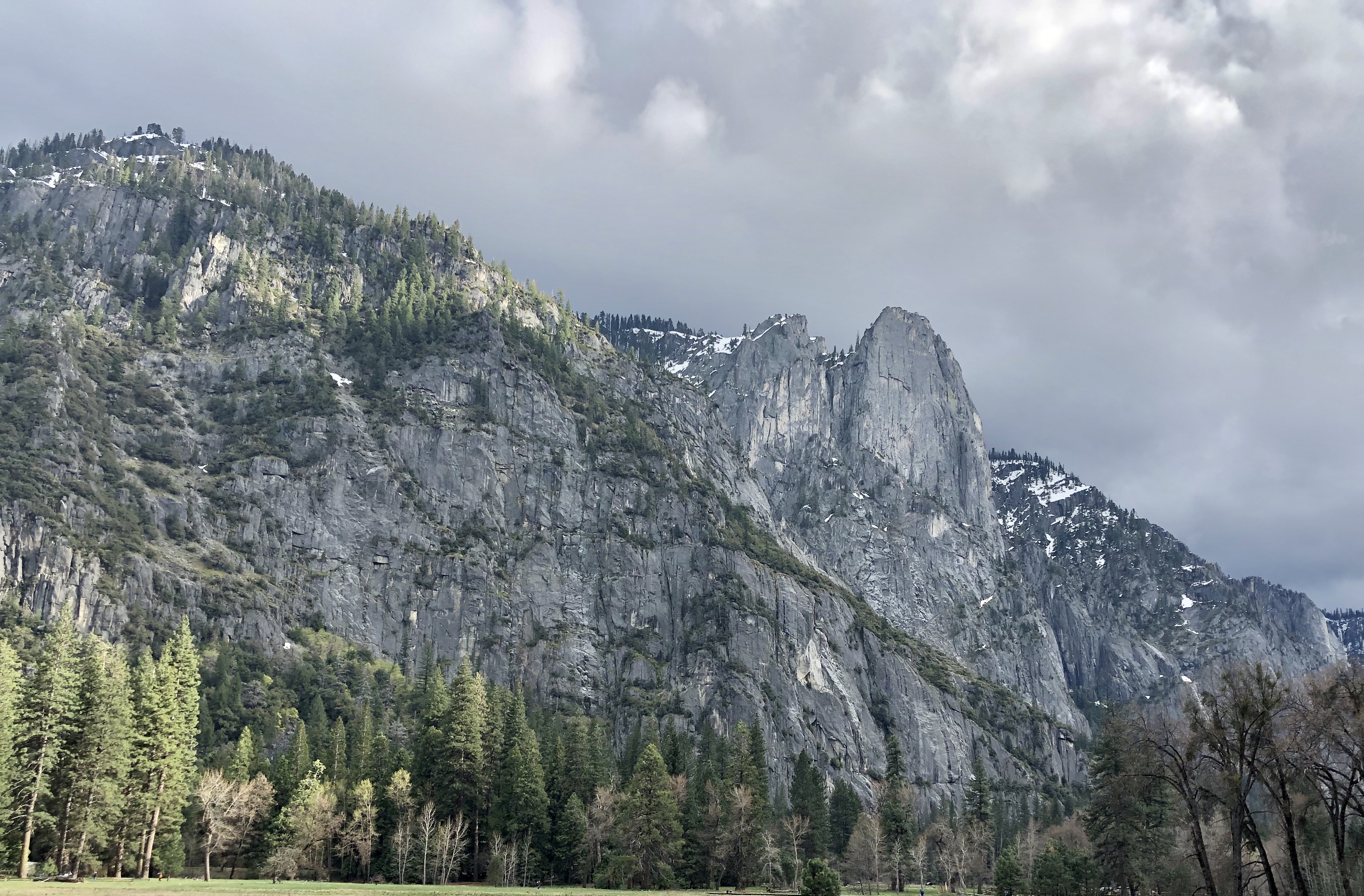
The San Francisco Skyline at night was another image I downloaded from Wikimedia Commons and is by user Cgbriggs19. Moving clockwise, you can see “El Capitan”, which can be found in Yosemite National Park, our favorite day trip out of the Bay Area. The next image is, of course, the Golden Gate Bridge. Below is a picture I took of the pacific ocean from Land’s End, our favorite hiking trail in San Francisco. Of course, Mocha’s face is the first thing you see. My decision to use Mocha as the “boundary” for all the pictures was in order to achieve unity in the final result.
If I could put a title to the process for this image I would call it “mask & clipping masks.” Originally, the image was built like this:
Layer 0: A Mask of Mocha’s face, which I created by doing a layer via copy.
Layers 1 – 4: These layers are the pictures. I made a clipping mask for each picture and worked on each image individually. Tweaking the opacity of the images while I was moving them around helped a lot to get the final look I wanted.
Layer 5: This is a copy of Layer 0 that I put on top of all the images and I got the see-through look by switching the blending mode to “screen”.
I finished by adding text, adjusting the color of all the layers and background, which I am not 100% sold on.
Wags and Kisses,
Mocha’s Mom.

.jpg)
Hi Mocha’s mom!
First of all, I love your dog.
I really liked the complexity of your piece. I like the thought and detail that you put behind all the components and I like that it tells me more about you! I like that Mocha is the center of the piece which doesn’t have to cause the reader to figure out what the focus is. Especially because you had several components to your piece. I think using Mocha as the center and embodying everything else within him was a good choice! I had a little trouble seeing the second photo you incorporated (water and rocks). I think that can just be adjusted slightly with opacity! I also wonder if getting rid of the lighter blue line (from the skyline photo) above Mocha’s name might help it stand out! (I think you can utilize the eraser tool with a softer edge in that layer).
Super cool draft!
Lizzie
LikeLiked by 1 person
Hi Karla!
First off, Mocha is adorable! I can’t wait to see more photos of him and read about your adventures!
Also, I like both styles of collage you were working on. And, you are absolutely correct! The Polaroid definitely made me think about family road trips.
If you continue with this one, I would switch one of the photos of Mocha, seeing as they are both at beaches, which could make the viewer assume that most recommendations are beach and/or water based.
Your second image has a very different feel to it than the first. I know what you were going for, but there’s something about it that feels a little off for my eye. I would almost suggest putting the Land’s End photo behind Mocha, as it’s the photo you don’t see as well in the overall image currently.
I would also stretch the evening skyline photo, so it comes to at least his chin fur. The line right under his nose is distracting and that line is right where my eye is being drawn to every time I look at your piece.
I really like the combination of the Golden Gate Bridge, the skyline and El Capitan over Mocha’s face, though. I really get a sense of what the blog is about just by looking at his face.
–Leann
LikeLike
Thanks Lizzie.
I see we have 2 classes (virtually) together.
I did notice the problem area around Mocha’s name. I also considered erasing his name from the bandana to make the picture more noticeable.
LikeLike
Hi Karla, can I just say, your dog is the cutest! My fiancé and I are debating on what kind of dog we’re going to get when we get married right now. I really like the use of the paw cut out as the main focus. I think if you just move the photo of you and Mocha over a little bit then your head won’t be cut off and we can get a full view of the both of you. I also think that the main image of the paw could be Mocha while the other two could be places in San Francisco or the Bay Area in general. You could put in Dolores Park or a certain park where a lot of dogs hang out. Or a dog-friendly restaurant with a patio in the area would be a good image too. Just so we can see all the places where puppies are welcomed! Overall, I think you have a great start on your project, and I cannot wait to see the final result!
LikeLike
Hi Karla,
In Photo #1 I really like what you did with the paw print. The shadows within the print effectively separate the foreground from the background. I also enjoyed your use of the figure-ground principle, and few things in life are better than puns. (Do you mind if I borrow “Pawrents?”)
The cutout of Mocha in the snow looks a little choppy around the edges, but an edge feather (Select>Feather) could soften some of the jagged bits on the edges.
It looks like you took some steps to match the lighting on Mocha with the lighting on the Golden Gate Bridge, but the posterization gave Mocha some highlights that don’t quite fit the rest of the image.
Photo #2 is very cool! This is well done, and I the masks on the background images look quite complicated indeed!
In the foreground (Mocha), it looks like a bit of the dark couch is visible, particularly around Mocha’s ears and neck.
Behind “Woofcome to the Bay Area,” the texture of Mocha’s fur and bandana make it difficult for me to read. It might be helpful to erase that part of Mocha and show the gradient background instead.
Before seeing your work, I hadn’t considered that my dogs might enjoy a trip to the Bay Area. Mocha makes it look so fun!
Zack
LikeLike
I submitted two photos because I was very undecisive about the style I wanted. I will continue to make Mocha or a dog related shape (such as a paw) a central theme of the picture, since this was a point my colleagues pointed out they liked. I will use masks and layers because I can integrate several pictures of destinations, however, I need to find a better way to blend them, one that makes it easy for people to appreciate the pictures. They mentioned that some of the photos weren’t easy to see. I definitely need to work on blending and the final result because some areas of the mask I made from the dog’s face are distracting.
There are two things my colleagues did not point out but I realized through critiquing their work: I did not fully utilize Gestalt principles in the second picture. I personally liked the complexity of blending so many layers in a mask, but after going through other blogs, I definitely see I need to incorporate more Gestalt principles in my work. Another aspect that none of my colleagues mentioned, but I realized after going through their blogs is that I didn’t include links to other websites. Besides being a good blogging practice, this can help improve the site for SEO purposes as well. I am adding links to the places I mention on my post.
To sum it up:
• I will build on the strengths of my designs: using Mocha or dog Paw as a central theme, blending different destinations of the Bay Area.
• I will improve the arrangement and opacity of all the pictures I use.
• I will incorporate more characteristics of the Gestalt principles.
• I will add links to relevant websites to my final blog.
LikeLike